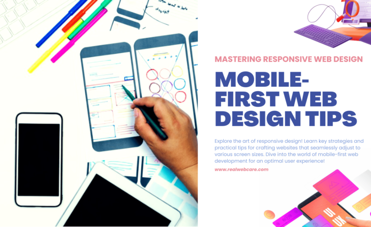
Mobile-first Web Design Tips: Mastering Responsive Web Design
Mobile-first Web Design Tips are essential in the age of smartphones and tablets. It’s no longer enough for a website to look good on desktop computers alone. With the majority of internet users accessing the web from mobile devices, it’s essential for businesses and designers to prioritize mobile-first web design.
Therefore, Responsive Web Design (RWD) has become a crucial approach in today’s digital landscape, allowing websites to adapt and provide an optimal viewing experience across a wide range of devices. But what exactly does that mean, and how can you master responsive web design?
In this article, we offer practical tips for creating adaptable websites. These sites will fit any screen size. This ensures a user-friendly experience across all devices. Whether you’re an experienced web designer or a beginner, this guide is for you. It will help you stay ahead in the fast-changing world of mobile-first web design.
Mobile-First Approach: The Foundation
The first and foremost best practice is to adopt a mobile-first approach. This means starting the design process by focusing on essential content and functionality for mobile devices. By doing so, we ensure that the most important aspects of the website are prioritized, creating a streamlined user experience. This approach also allows for easier scalability to larger screens, as elements can be added progressively without compromising the core functionality.
Fluid Grids and Flexible Images: Essential Elements for Responsive Web Design
Another crucial aspect of mobile-first development is the use of fluid grids and flexible images. It is essential to utilize relative units like percentages for layout elements and images. This allows the content to adapt fluidly to different screen sizes without sacrificing quality. By adopting this technique, the website can seamlessly adjust to various devices, providing a consistent user experience.
Media Queries in Mobile-first Web Design
CSS media queries play a significant role in implementing responsive web design. They allow developers to apply different styles based on the device’s characteristics, such as screen width, orientation, or resolution. Media queries help create breakpoints, enabling a smooth transition between different screen sizes. By utilizing this technique effectively, the website can adapt and render appropriately on any device, enhancing user satisfaction.
Performance Optimization: A Crucial Mobile-first Web Design Tip
In addition to design considerations, performance optimization is vital in mobile-first development. Mobile users often face challenges such as limited bandwidth and slower internet speeds. Prioritizing performance ensures that the website loads quickly and efficiently on mobile devices. Techniques like image optimization, CSS, and JavaScript minimization, and lazy loading can significantly improve page load times. By optimizing these elements, the website becomes more accessible and user friendly, especially for mobile users.
Touch-Friendly Design: A Key Responsive Web Design Tip
Ensuring touch-friendly design is another crucial aspect of mobile-first development. Given the increasing prevalence of touchscreen devices, it is important to design elements that are easily clickable and navigable through swiping. Interactive components should have sufficient spacing to accommodate touch-based interactions, avoiding accidental taps or misinterpretation of user actions. By implementing touch-friendly design practices, the website becomes more user-friendly and intuitive on mobile devices.
Cross-Browser and Cross-Device Testing:
Cross-browser and cross-device testing is a fundamental step in mobile-first development. Websites should be thoroughly tested across various devices, browsers, and screen sizes to guarantee a consistent and user-friendly experience. This ensures that the website functions properly on different platforms, providing a seamless experience for users, regardless of their choice of device or browser.
Accessibility: A Priority in Mobile-first Web Design
Finally, it is vital to design with accessibility in mind. Websites should be perceivable, operable, and understandable by users with diverse abilities. Considering factors such as color contrast, font size, and the use of alternative text for images are essential in ensuring an inclusive and accessible web design. By prioritizing accessibility, websites become more user-friendly and comply with accessibility standards and regulations.
Mastering Responsive Web Design is key to succeeding in today’s mobile-centric world, and this can be achieved by adopting Mobile-first Web Design Tips. By designing for mobile devices first and utilizing fluid grids, flexible images, and media queries, businesses can optimize their websites for a wide range of devices. Prioritizing accessibility and implementing touch-friendly design, along with thorough cross-browser and cross-device testing, ensures a user-friendly experience across all platforms.
These Mobile-first Web Design Tips not only enhance user engagement but also drive increased traffic, contributing to the success of online businesses in the increasingly mobile-driven landscape
For more insights on how to effectively implement these tips, Google’s guide on Mobile Site and Mobile-first Indexing Best Practices is a valuable resource. This guide provides a deeper understanding of each tip and how to apply them in real-world scenarios, making it an essential read for anyone looking to master mobile-first web design.


There are no comments yet for this post