
3 LIGHTBOX SCRIPTS
Awesome Responsive Photo Gallery Pro – Masonry View
Awesome Responsive Photo Gallery plugin has the support of masonry that is associated with the popular jQuery Masonry plugin. Masonry is a grid layout based on available vertical space. Basically, it is a JavaScript grid layout library that optimizes the use of space inside the web page by reducing any unnecessary gaps.
What is Masonry and Why Do You Need It?
A Masonry layout is an intelligent grid system that arranges images based on the available vertical space. Unlike rigid, traditional grids that force every row to have a uniform height, Masonry acts like a bricklayer fitting stones together. It fills in the blanks dynamically, minimizing large, awkward gaps caused by images with different orientations or aspect ratios.
If your gallery contains a mix of portrait and landscape photos, a standard grid will leave messy empty spots. Masonry solves this completely, creating a tight, cohesive showcase that keeps visitors engaged and scrolling.
-
Ranunculus
Lorem ipsum dolor sit amet

-
Wooden Bridge
Lorem ipsum dolor sit amet
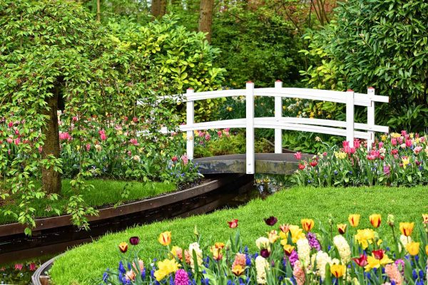
-
Cat
Lorem ipsum dolor sit amet

-
Tulip
Lorem ipsum dolor sit amet

-
Swan
Lorem ipsum dolor sit amet

-
Star Magnolia
Lorem ipsum dolor sit amet

-
Marguerite
Lorem ipsum dolor sit amet

-
Waterfall
Lorem ipsum dolor sit amet

-
Owl
Lorem ipsum dolor sit amet

-
Flower
Lorem ipsum dolor sit amet

-
Poppy
Lorem ipsum dolor sit amet

-
Klatschmohn
Lorem ipsum dolor sit amet

-
Forget Me Not
Lorem ipsum dolor sit amet

-
Bird
Lorem ipsum dolor sit amet

-
Flower
Lorem ipsum dolor sit amet

-
Environmental Protection
Lorem ipsum dolor sit amet

-
Animal World Tiger
Lorem ipsum dolor sit amet

-
Apple Blossom
Lorem ipsum dolor sit amet

-
Cherry Blossom
Lorem ipsum dolor sit amet

Why This is a Game-Changer for Our Plugin
Our plugin integrates this powerful layout directly with the trusted jQuery Masonry library, giving you an automated way to build stunning galleries. The best part is that you do not need to manually crop or resize your images beforehand. Just upload your photos, and the plugin instantly calculates the optimal fit for a polished, magazine-style layout. It ensures a flawless presentation across all screen sizes while maximizing screen real estate.